Eko taxi:
Eko taxi is one of the leading taxi services in Croatia, present in a dozen cities. Considering the ever-increasing amount of companies that are in the same line of business, the time is ripe for a fresh new image and a rebrand, intending to obtain a stronger position on the market.
Challenge
The brand needed to be modernized to impose itself to the competition as a brand that is in touch with market trends and innovations but simultaneously retains its “eco” component as a unique element that will distinguish it from the competition now and in the future.
Solution
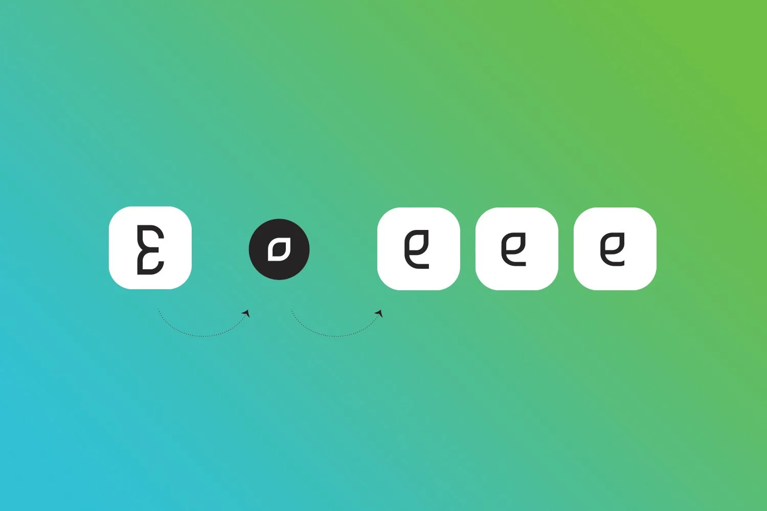
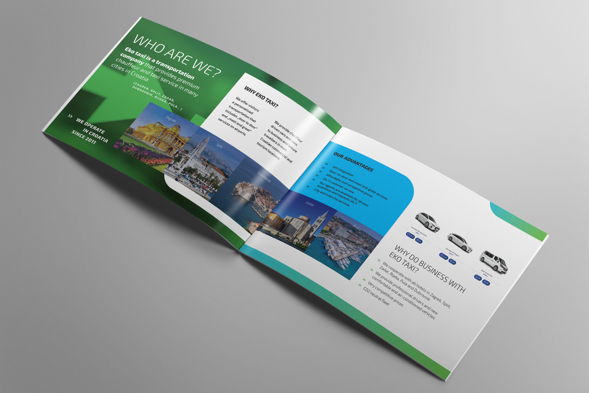
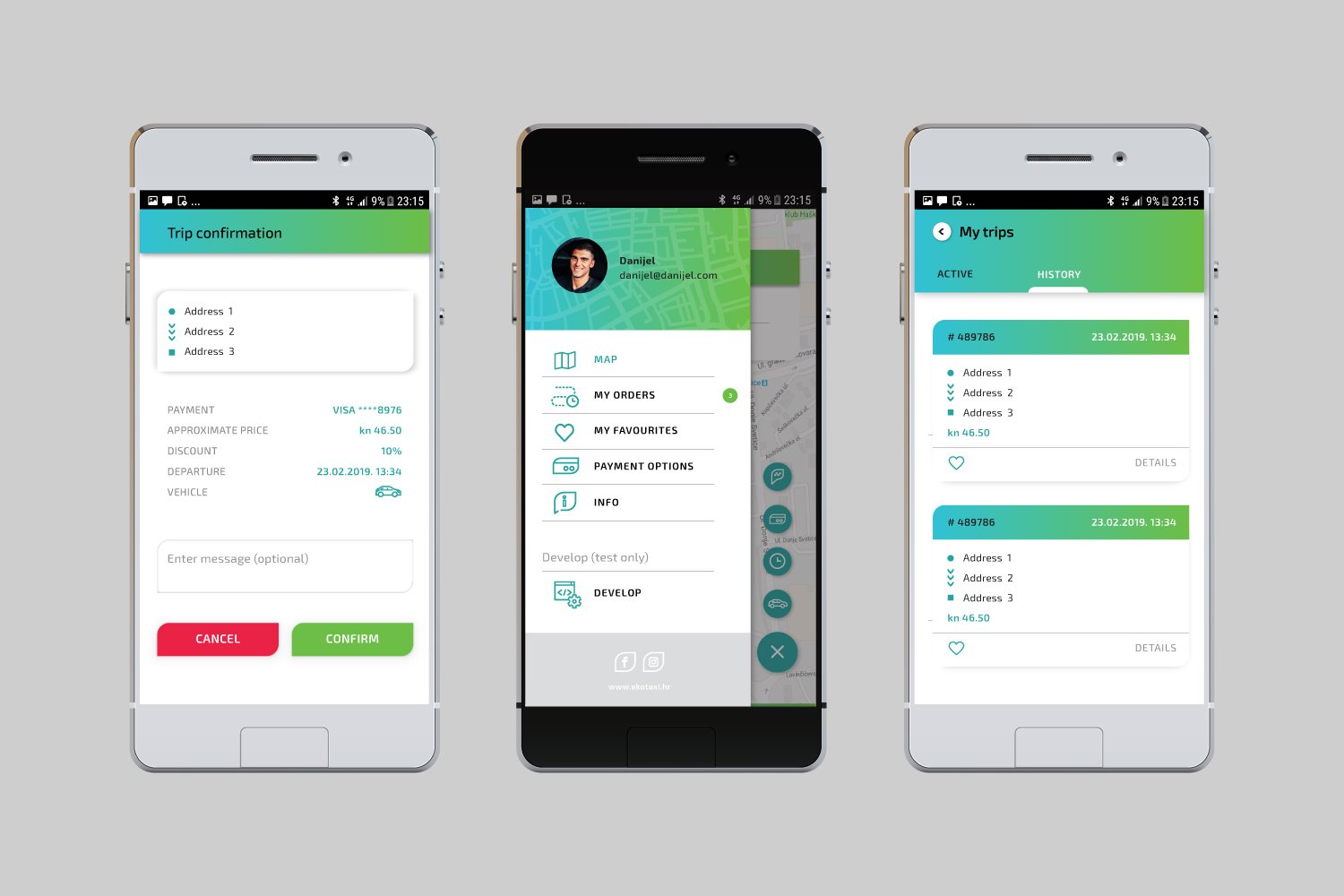
Speed, safety, quality, helpfulness, technology, leadership, and accessibility are the qualities that have guided the development of the entire redesign process, and which have set the foundation of the visual identity and messaging. The nucleus of the entire identity is the logo. The upper case “E” symbol has been changed into a lowercase “e”, giving precedence to our mobile app which can be used to order our taxis. The secondary element is the green gradient and a symbolic representation of a city map, showing crisscrossed streets which also evoke plant leaves, incorporating eco brand elements. To highlight the leadership elements, we recommended that the photographs used with the corporate identity materials are in black and white, with premium materials printed on black paper or placed on a black background. To punctuate speed, arrows are placed throughout the visual identity, and the italic type is used as a primary type. (Exo 2).


Visual for social channels
Copy & design (for Movember annual event)


