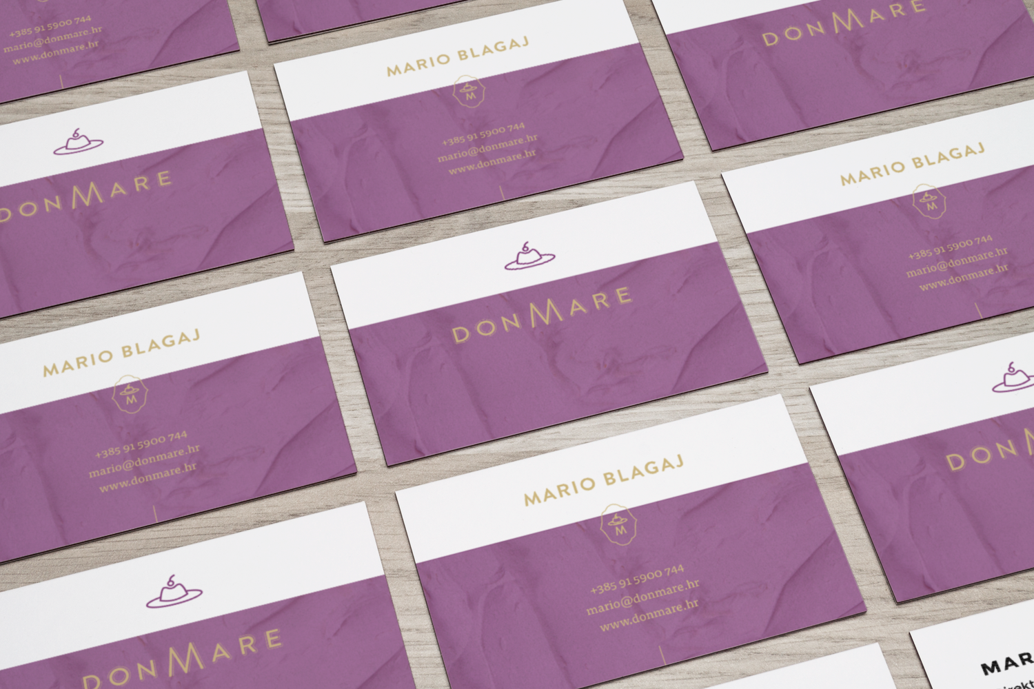
Don Mare
DON MARE is in the business of making and selling various kinds of confectionery and low-sugar sweets.
Challenge
Since the client is located in a place with little to no sweet shops, the competition was not a primary concern. The only demand was that the brand showcase innovation and creativity of the business, to signal that the brand is supported by the owner of the firm, who is also the head pastry chef. Tone and keywords: Elegant, enticing, simple, modern, delicious.
Solution
The owner wanted the main colors to be dark purple. “powdery” white, so that the identity has that usual “feel” typical for pastry shops, the goal being to communicate the purpose of the shop to the target audience. However, to avoid cliché designs, we have incorporated a masculine element – a hat that is evocative of a pastry typically produced in the shop. With this element, we’ve managed to play around with the name of the company and have introduced a romantic and seductive element, which is simultaneously mysterious and enticing.


